Standard emails have an average open rate of only 34.1%, according to Marketing Charts.
And the CTR is even lower than that.
And I mean way lower. We’re talking 3.1%.
I bet you that number is even lower for recruiters.
We get it: recruiters have a tough gig.
But they don’t help themselves by making some of the most cringe-worthy social faux pas imaginable.
Which may not be such a bad thing.
For you, anyway.
Because if you learn from their mistakes, you’ll never have to make those same mistakes when reaching out to potential customers for your business.
So let’s take a look. Here are the nine things you can learn from the failed-outreach attempts of recruitment’s past.
Mistake #1: Requiring recipients to squint and scroll
Except for the 353,000 of us who were born yesterday, we all know that when we send an email, someone will either open it on a desktop or a mobile device.
Here’s what happens when we forget that fact:
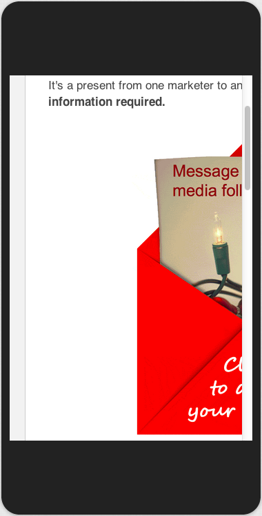
Optimizing an email for mobile should be a no-brainer.
Except, as you can see, it isn’t always.
It costs recruiters a lot of candidates. And could cost you a lot of replies.
No one wants to put in the effort to decipher a poorly displayed message. Especially when 55% of business emails are opened on mobile devices according to Return Path.
Your email needs to look just as attractive on a mobile device as it does on a desktop.
But it also needs to be formatted properly. We’re talking single-column. Easy-to-read text.
This email from Pipefy is a great example:
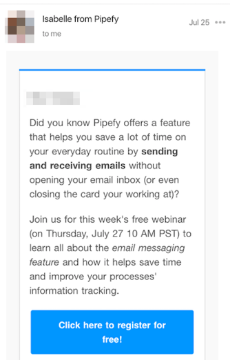
The email includes all necessary information. But it’s concise and doesn’t require the recipient to scroll down. (Or god forbid, left-and-right.)
The font is large enough to read. According to Firefish, headlines should never be less than 22-point font, and body text should be written in 11-point font or larger.
Finally, there aren’t any pictures.
Images–especially detailed images or ones with a lot of text–can appear cluttered on mobile devices. They might also set off the spam filter.
Instead, you may consider following this Pipefy example. Keep it simple. Focus the reader’s attention with an eye-catching font and color scheme.
Mistake #2: Spending two seconds on your subject line
When writing the perfect subject line, you may feel like you’re putting hours of work into a very small part of your operation.
It’s like coming up with the name of your product or business. A whole lot of work for a whole lot of nothing.
But it’s exactly that kind of thinking that lands us a show about six friends called “Friends.”
Or recruitment emails with subject lines like this:

Lesson one: Caps lock is not your friend.
Lesson two: The subject line of your email is your first impression. And your first impression is a big deal. And this person’s first impression is that you’re an idiot.
47% of consumers say it’s the exciting subject line that convinces them to open an email.
But the subject line above is more SCREAMY than exciting. The use of all caps and the exclamation point result in a whole lot of overkill.
Even worse, the “you’re invited” message is too generic to get anyone’s attention. It’s not specific enough to highlight its own importance.
Marketers aren’t immune to this problem. But while many stick to subject lines like “How to Generate More Leads,” you can send a message that won’t get shown the proverbial door.
In a previous post, we explored some of the best tips you can use when writing your subject line.
The process starts with incorporating an angle. Informational and even friendly subject lines don’t cut it anymore.
Instead, add a humorous, intriguing, or story-telling subject line to stand out in your reader’s inbox.
This unexpected subject line from LastPass is a great example:

“So you lost your Passport,” tells a hypothetical story that no other business tells with their emails.
Meanwhile, this Privy example shows another approach to writing a winning subject line:
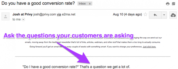
This subject line immediately piques the interest of all types of recipients–those who don’t know the answer to the question, and those who do and would like to make their conversion rate better.
Further, Privy came up with the question by drawing from questions they typically receive from users. It’s a surefire way to know you’re writing what people want to read.
After brainstorming your potential subject lines, there’s only one more thing to ask yourself: is your subject line too long?
According to Litmus, subject lines that are written in 50 characters or less typically see the best open and click-through rates.

After writing your subject line, check for any unnecessary words. Keeping the subject line as short as possible will keep your headline looking sharp, even on the smallest of screens.
Mistake #3: Using formalities that maketh recipients uncomfortable
It takes a special person to get the tone right in an email.
Come off too friendly, and you seem like an amateur.
Use multiple exclamation points, and you seem like you’re trying too hard.
One wrong keystroke and you go from reputable to shady, just like that.
When creating your tone, you need to think specifically about your company’s culture and the kind of image you are trying to promote.
Be sure to stay away from exceptionally formal language.
Old English is always unacceptable.
And fancy words you wouldn’t use in a typical conversation are probably out of the question, too.
Just take what the recruiter who starts out with “Greetings!” or “To whom it may concern” does.
Then do the exact opposite.
Think “business casual.” Here’s an example from Zapier:
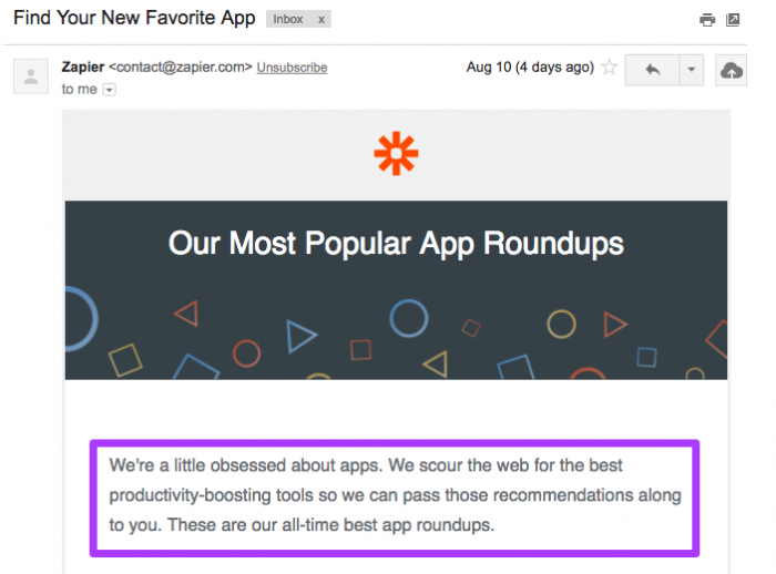
Just the first sentence, “We’re a little obsessed about apps,” is fun and full of personality.
Meanwhile, the next sentence provides relevant info for customers. Strike an even balance of laid-back language and productive information to make the most out of your copy.
And whatever you do, don’t mistake “casual” for “rude.” No one likes to be treated like this:

Get too condescending, and you’ll turn potential leads into conversions… for your competitors.
Mistake #4: Writing the same message everyone else is writing
According to City A.M., the average office worker receives 121 emails per day. That’s a lot to compete with.
Especially if one or more of those emails is selling the same thing you are.
When recruiters merely use the position title or responsibilities in their subject line, it’s not enough to engage readers.

Again with the caps lock.
Similarly, recruiters who make the subject line and message all about them will lose out on potential applicants.

Don’t let the same thing happen to you. Use your limited space to highlight what makes your service special instead of assuming your audience will visit your website and discover this for themselves.
If the subject line is your first impression, then the body of your email is your first-and-a-half impression. It’s the perfect chance to explain what you do and why you do it better than your competitors.
This example from Sleeknote addresses both those points in just a few short paragraphs:
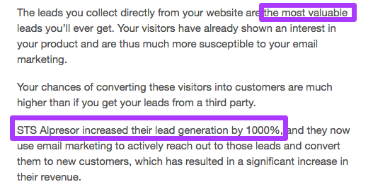
From this email, I see that Sleeknote is a business that helps me target a specific set of leads because those leads are more valuable to me than any other lead.
As the message continues, it differentiates Sleeknote from competitors by giving an outstanding customer testimonial.
It’s not a novel. But it’s enough to prevent it from being generic and, consequently, sent to the trash folder.
Mistake #5: Asking for too many next steps
The only thing people have less of than money is time.
Think about it. You’ve got a lot to do today. When you check your email, the last thing you want is another to-do list to add as a sublist on your already daunting checklist.
This is one of the reasons so many recruitment messages fail. Recruiters are using templates (which is a problem in and of itself) like these:

If someone can get a similar job from another company without doing the extra work, they will.
The same is true for your campaign. The less you ask of your customers, the more likely they are to do what you ask.
That’s why conversions rise dramatically when forms are shorter, as seen in this Quicksprout study.
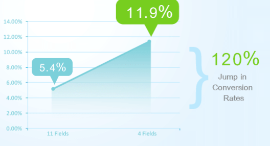
Make things easy for your potential leads. You can see how this works in another example from Sleeknote:
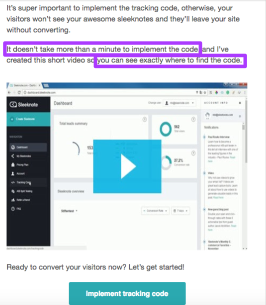
Right away, users are promised that the detour they take to Sleeknote’s website won’t take more than 60 seconds. Sleeknote also provides easy access to a short how-to video.
Meanwhile, a CTA within the email links users directly to the company’s website.
Try something similar to quickly alert new users to what your business is all about. The easier you make your information to find, the easier it will be to spread the word about your business.
Mistake #6: Forgetting the call to action
Recruiters make this mistake from time to time. They send messages to candidates telling them what a “great fit they’d be for position X.”
They say “apply now!”
And then they don’t tell them how to apply.
This may give the candidate an ego boost. But a job? Not so much.
Your message needs a good CTA.
I probably couldn’t say anything more obvious. Except maybe “don’t have typos.”
But really, you don’t contact potential leads because you’re lonely or you like the sound of your email voice. You want your recipient to take some sort of action.
Forgetting a CTA button completely isn’t an especially great way to make that happen. Neither is creating a CTA button that doesn’t do its job. Your call to action should be concise, attention-grabbing, and easy-to-click.
This email from the Denver Rescue Mission is a perfect example:

As a recipient of this email, I don’t have to guess where to click or what to do next. I also know exactly where the CTA button is going to lead me: a page where I can learn more about getting involved.
Also, make sure your CTA matches up with your subject line. They don’t need to be identical, but if your subject line suggests something about a new feature, your CTA button should send people to the page for that feature, not just your homepage.
Let’s turn to Starbucks for some inspiration:

The person who opens this email is expecting to learn how they can get 50 bonus stars by loading $10 on their card. Does the CTA line up with their expectations?
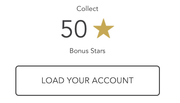
Lines up perfectly. When users click on the button, they are redirected to the page where they can add money to their account, exactly like they expected to be.
Mistake #7: Sending the never-ending message
But wait, there’s more!
These are four words you can use to make recipients exit out of your email.
Recruiters have a lot to say. They have to tell you who they are, where they’re from, and why they’re reaching out to you. They also need to include what position they’re recruiting for, what the salary is, where the job is located, and what you should do next if you’re interested.
It’s possible you just skimmed that entire paragraph. Which is exactly my point.
I doubt recruiters sit down to write an email and think, “how can I make this email as long as possible?” They know as well as anyone that the people want short and sweet.
The thing is, that can be hard to execute, especially when the information they’re trying to convey is complicated.
That’s how the never-ending message is born.
Thankfully, you can learn from this and avoid writing the 5-10-15 paragraph messages that no one wants to read.
You want to be sure to cover all the basics of your product or website, but don’t go crazy with bullet points. Save the especially-detailed details for your website, and provide links to more info, like Lob does:
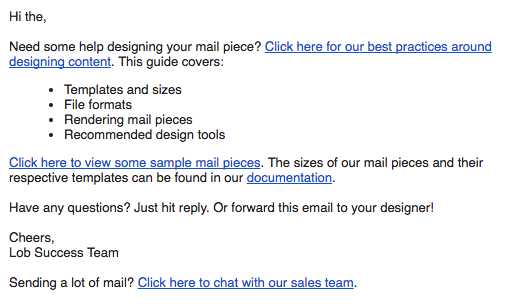
This email requires no scrolling or skimming, but it still incorporates all the necessary info and resources to get its point across.
Mistake #8: Sending too many follow-ups
Sometimes, you’ve got to face the facts.
She’s just not that into you.
Recruiters have a hard time facing these facts, which is how we end up with inboxes like this one.
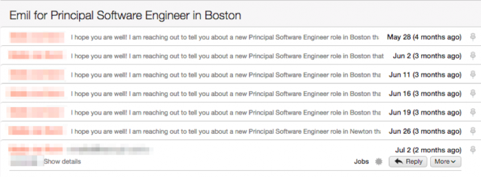
Don’t make the same mistake.
It’s true that no response doesn’t equate to no interest. But three or four unanswered emails?
That’s a different story.
Try an engaging but not-pushy strategy by reaching out only two or three more times after your first email.
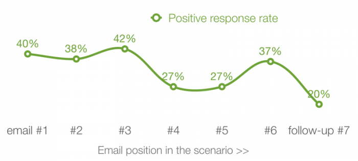
In a study by IKO System, the most consumers responded positively–that is, not with a request to stop receiving emails–to the third email they received from a business.
Old Navy puts this into action by sending several messages about their discounts, specifically noting when recipients have only one chance left:
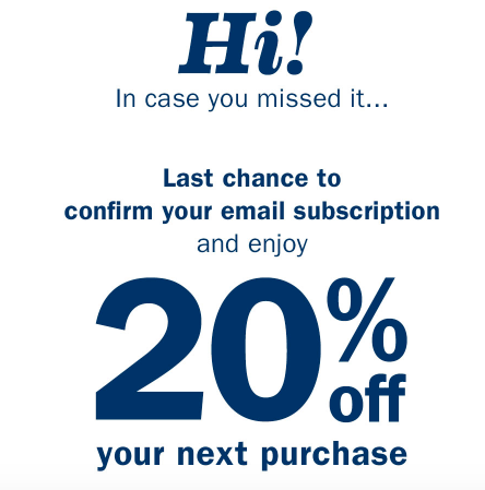
Try sending these “in case you missed it” emails to keep your deals from getting lost in the clutter.
Meanwhile, a follow-up email can also be useful as you build towards the hard sell. You should never ask for an immediate commitment from a cold lead. Use a series of emails to warm customers up to the idea of converting by the second or third email instead of the first.
Mistake #9: Not tracking your numbers
After all that, you have to ask yourself: why do recruiters still make these mistakes? Shouldn’t they know what works and what doesn’t?
A perfect segue into the final mistake: not tracking the metrics for your campaigns.
Recruiters who don’t track their metrics have no way of knowing their emails aren’t getting opened. That’s why they keep using ,the same tired subject lines, call to actions, and incorrect names.

Case. In. Point.
You’re going to experiment with your tactics. And you can do yourself a huge favor by tracking the results of your efforts.
Which subject lines got the most opens? Which links got the most clicks? Knowing every aspect of your campaign can help you better understand what your customers are looking for.
You can sign up for a tool like Mailshake to assist your outreach efforts.
As you send your emails, your Mailshake statistics will update automatically:

On your dashboard, you can see the following:
- How many of the emails you tracked have been opened?
- How many of those emails were opened more than once by the same recipient?
- How many of your links have been clicked?
- How long it takes your recipients to open your emails?
You can also find info on your best performing subject lines and the optimal times to send messages to your specific client base.
Mailshake can then help you plan how to design your messages by tracking what types of devices your recipients are using to view your emails.
This tool even helps you go beyond tracking open rates, and tracks who specifically is opening your emails. By tracking who clicked and who didn’t, you can tailor your follow-ups to be more specific than ever before.
Conclusion
The road to success is paved with failures. The only way to know that something won’t work is to try it out and watch it crash and burn.
Unless the idea is truly horrendous. Then you can skip the crash and burn part.
But for every other idea, you can learn from those times recruiters attempted, regretted, and amended it. Thanks to that, you know exactly what not to do in your marketing efforts.
And, by process of elimination, you know exactly what to do, too.
From subject line to body text, make sure your content showcases what you do best.
Remember the simple things, and don’t be afraid to experiment with (and track) new tactics that can turn your once-disinterested contact list into the engaged, converting following you always knew they could be.
And whenever in doubt, just look at what recruiters are doing.
Then do the opposite.