You can create the perfect eCommerce email with enticing copy, spectacular images, and a geniusly-worded call-to-action—but if no one opens your email, none of that matters. After all, if a perfect eCommerce email falls in the forest…
The average open rate for an eCommerce email is roughly 15.7 percent. There’s a lot of room for improvement there. That’s why marketers put such a heavy focus on how to make their emails more enticing in the inbox.
Your goal is to make your emails look so irresistible your customers can’t help but click on them. Every element of how your email looks in the inbox plays a huge part in that; your subject line, from field, and preview text are the “elevator pitch” to get your customers to open your email.
When you send those emails also makes a difference. Almost one in four opens will happen within an hour of you sending your email. An hour after that, your chance of someone opening your email drops by 50 percent. So optimizing your send timing is another key piece of getting your emails the eyeballs they deserve.
In this article, we’re going to dig into studies and tips for improving your inbox presence and email timing—which should help with the key task of raising your open rates.

Subject lines
According to one study, more than one-third of people will open an email based on the subject line alone—and that feels like a conservative estimate. Subject lines are the most prominent facet of your inbox presence—they’re generally in bold text, after all—so optimizing them is a crucial part of any email marketing strategy.
Subject line length
There have been a lot of studies into the optimal email subject line length and the results are… to put it generously, we’ll say “inconclusive.”
Where subject line length does really matter is for mobile emails. At least two-thirds of emails are now opened first on mobile devices, and you want to make sure your subject lines fit on the smaller screens. Ideally you should keep the length at 35 characters or less, which should be safe for virtually all modern smartphones using all different font sizes.
Subject line content
There are a number of different content strategies you can employ for your email subject lines. Here are four of the most effective:
- The curiosity gap. This is an open-ended subject line that entices a user to click to find out what you’re talking about. Ask a question, write an ambiguous statement, say something bold, or promise something surprising or unusual.
- Topical or funny. Topical and funny subject lines keep you relevant, show off some personality, and establish immediate common ground with your readers.
- Honest and direct. If you’ve got a good offer, just tell your subscribers about the offer. Subject lines that are clear and straightforward performed 541 percent better than other subject lines in one study.
- Scarcity and urgency. Humans are conditioned to respond to a sense of scarcity or urgency—it’s the hungry, survivalist caveman in all of us. It’s why words like urgent, breaking, important, and alert all increase open rates.
There are some things you need to watch out for with your subject line content as well. Words that aren’t exciting—or look like you’re giving a reader homework—are poison to your open rates. Watch out for words like journal, forecast, whitepaper, learn, and report.
You also need to avoid words that make your emails look like spam—both to your readers and to email clients. That includes words like opportunity, miracle, save $, f r e e, and double your income.
Subject line examples
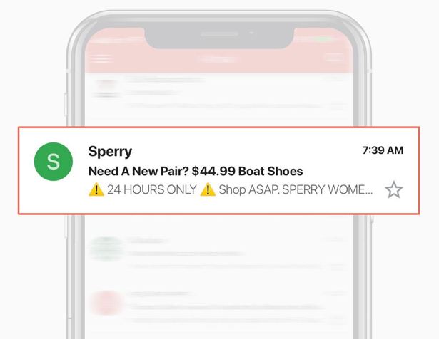
Here’s a great subject line from Sperry that hits a lot of the notes above. It’s a tight 34 characters for mobile safety and takes the straightforward approach with its offer of $44.99 boat shoes. It also presents the email as useful by starting with “Need a new pair?”—it’s not encouraging you to consume for consumerism’s sake, it’s checking to see if you need new shoes and offering you a deal on them. (It also creates urgency with the preview text, which we’ll get into later in the article.)
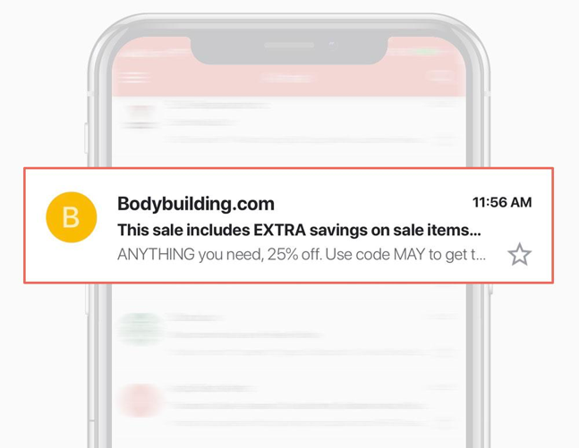
Bodybuilding.com does a good job with this subject line advertising a sale. It presents a good value proposition (extra savings on sale items) but also sets up the curiosity gap by making you wonder just what those sale items are and just how big of a discount it is. The subject line doesn’t stick to the 35-character recommendation, so it was cut off on my phone screen, but all of the key info in the subject line is front-loaded to make sure no one misses the most important content.
From field
The from field is arguably the most neglected part of email marketing, but it can be an important tool for establishing your credibility and authenticity—and for setting the tone of your email. It’s also a surprisingly large factor in your open rates; one study even found two-thirds of people say the from line is more likely to make them want to open an email than the subject line. (PDF)
From field length
Much like with your subject lines, there’s no magic length for the from field—except to make sure it looks good on mobile.
The from field often has even less screen real estate than the subject line, so you should aim to keep it under 20 characters to stay safe on smartphones.
From field content
There are some different routes you can go with your from field; it all depends on what tone you want to set with your email.
- Your company name. The most straightforward approach to the from field is just including your company’s name. It’s simple but credible and won’t distract. Plus, if your brand has a good amount of cachet or very loyal fans, it’d be a shame not to have it right there in the inbox. We’d also recommend using your company name if you don’t send emails frequently—you’ll want your name there as people might not have your brand at the front of their minds.
- A real person’s name. When you set the from field to a person’s name, it gives a different set of expectations to an email. The customer will be expecting something more personal, maybe even a plain text email. So a real person’s name is good on things like welcome emails, requests for feedback, and personalized offers.
- Something creative. If it’s on-brand and you’ve got a great idea, you can get creative with the from field. Be aware, however, it’s a high-risk, high-reward strategy. If your idea works, it can help engagement, but if it doesn’t work, your email might just come off confusing and will go unopened.
From field examples
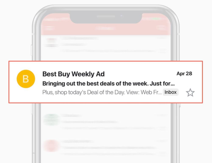
Best Buy takes the “company name” approach with this from field. But, thanks to their short name, they have room to keep going with their from field. So they added “weekly ad” as a way to differentiate from their other emails—and to sneak a marketing hook into the from field.
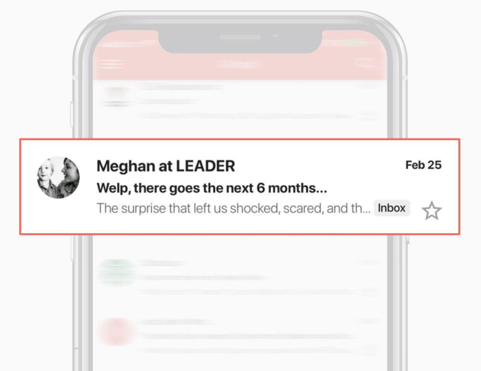
In this from field, Leader adds the personal element by having the email sent from “Meghan at LEADER.” That implicitly lets the subscriber know that the content here could be more personal and less sales-y. It’s also a nice touch to set the avatar in the email to a picture of (what a subscriber can only guess must be) Meghan with her son. (Here’s a guide to setting up custom avatars for your email—it’s not as intuitive or simple as it should be.)
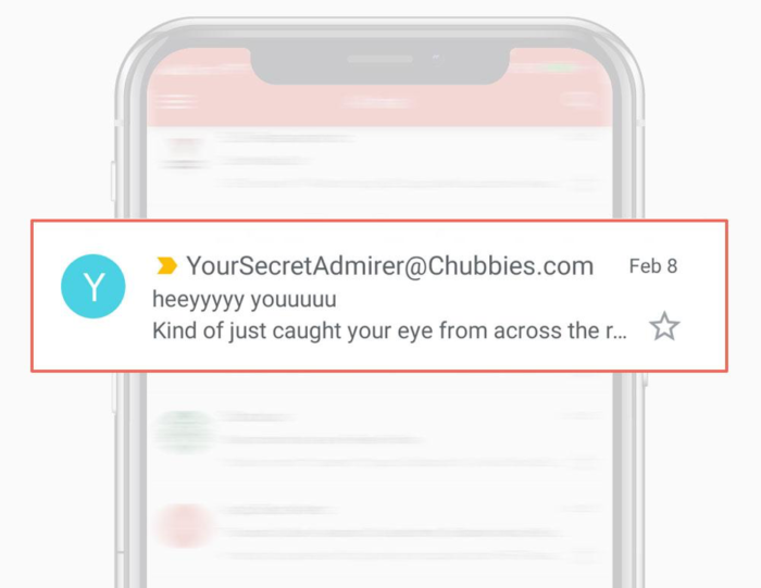
And in this email, Chubbies takes the high-risk, high-reward tact we discussed earlier with a creative from field. But since it’s on-brand for such a nostalgia-heavy company, harkening back to when we were kids and would pass notes in class, it helps make the email more intriguing to subscribers.
Preview text
Preview text is the line that appears either under or next to the subject line in many email clients. If you don’t set the preview text, it will automatically be the first line of your email—but that’s a wasted opportunity. Good preview text works in tandem with the subject line to entice subscribers to open your email. And it’s effective; 24 percent of customers say the preview text is the biggest factor in deciding whether to open an email.
Preview text length
Much like the other inbox elements, there’s no silver bullet with it comes to preview text length. Your main constraint is fitting onto tighter screens without being cut off. And in order to do that, it’s wise to keep all of the important content from your preview text within the first 35 characters. That should keep you safe across devices, platforms, and email clients.
Preview text content
The goal of the preview text is to fill in the gaps left by your subject line. If you think of the subject line as the “headline,” that makes the preview text your “sub-headline.”
To that end, the best approach with the subject line-preview text combo is to have one be a catchy or witty sales pitch, and have the other one deliver the value proposition in a straightforward manner.
Preview text examples
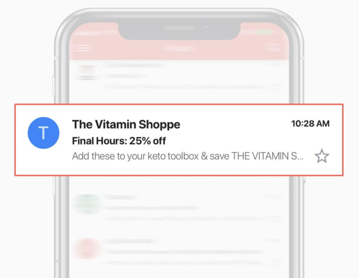
Here’s an example of subject line value proposition, preview text marketing pitch. Vitamin Shoppe creates a sense of urgency and offers a good deal with the “Final Hours: 25% off” subject line. Then they draw in the customer more by elaborating a bit on the sale: “Add these to your keto toolbox & save.”
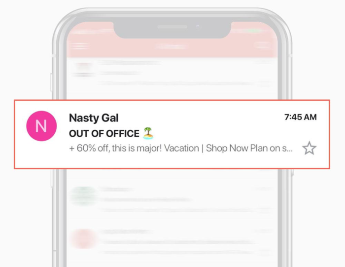
And here’s an example of the opposite: Subject line marketing slogan, preview text value proposition. Here the subject line sets up the vacation vibe of the email, complete with the palm tree emoji. Then the preview text relays that it’s a 60 percent off sale.
What times should you send emails?
While the content of your subject line, from field, and preview text are all important in optimizing open rates, timing also plays a big factor.
It’s important to note that the ideal send times vary greatly from industry to industry, business to business, and even customer to customer—so timing is definitely an area that warrants lots of testing and ultimately may benefit from segmentation. But there are some studies that have looked into broad timing patterns, from which we can draw, at the very least, a jumping off point.
Day of the week
We have the results of three major studies into email timing, and here’s what they found:
- All three agree that weekdays are better than weekends.
- One found that Tuesdays are the best days overall.
- And one found Wednesdays are the best days overall, with Tuesdays second.
In other words, you’ll probably want to send your emails on weekdays, preferably mid-week.
Time of the day
Here’s what the studies found about time of the day:
- All three agree that you should send email in the morning or afternoon, with sharp drop-offs in the evening.
- Two found that 10 AM is the best time, one found 11 AM.
- If you want to send in the afternoon, the 3 PM to 4 PM hour tested the best.
So mid-morning or mid-afternoon are the best times to send emails.

Key takeaways
No matter how great your marketing emails may be, they won’t work if no one’s reading them. You can up the chance of more people reading them by optimizing your inbox presence and your timing.
The keys to having a stronger inbox presence are:
- Writing subject lines that feature clickable content. That can include a curiosity gap, something topical or funny, an honest and direct presentation, or a sense of scarcity or urgency.
- Making sure your from field sets the tone of your email either by establishing credibility or a personal touch.
- Crafting preview text that works hand-in-hand with your subject line in order to convey the most important and relevant info.
- And restricting your character counts on all three to make sure mobile users won’t miss out on everything you have to say.
As for the correct timing:
- In large studies, weekdays test better than weekends, with Tuesdays and Wednesdays having the highest scores.
- And mid-morning and mid-afternoon get better responses than other times of the day, especially evenings.
- However, this is a situation where testing is warranted, as the correct timing can vary by industry, business, and even from customer to customer.
*** This is a guest post from Max Rice, the cofounder and CEO of eCommerce email marketing platform Jilt. He started his career in eCommerce over a decade ago and writes regularly about running an online store on the Jilt blog.***